7

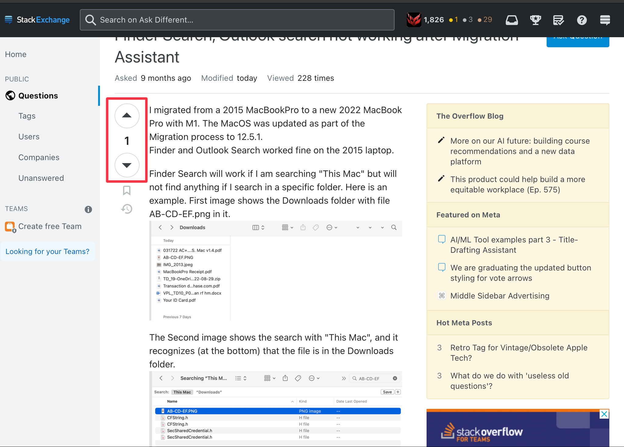
I just noticed that in the past hour, some changes were made on voting buttons, it became:

enter image description here

Why were these changed? The previous ones were really good.

Those ones are unaesthetic and aren't even well-made (to me), they're too big and encourage misclicking. Also, they are too visible, the previous ones were discreet and that was great.

3
  • 1
    Also, on AD Meta, it's hard to tell if you've voted a post or not, it's not as visible as the previous orange.
    – Thinkr
    Commented May 30, 2023 at 16:29
  • 2
    looks like they've fixed that... was super subtle this morning and now it is a completely filled in black circle...
    – dwightk
    Commented Jun 2, 2023 at 21:02
  • @dwightk Yep, just saw that. ;)
    – Thinkr
    Commented Jun 3, 2023 at 7:56

2 Answers 2

6

Such changes are usually applied across all SE sites, and discussed in Meta.SE. Looking at the votes there indicates that you are not alone with your opinion.

There is nothing we can do an AD to have it changed. If you want to push for a change, please participate in the discussion on Meta.SE.

0
4

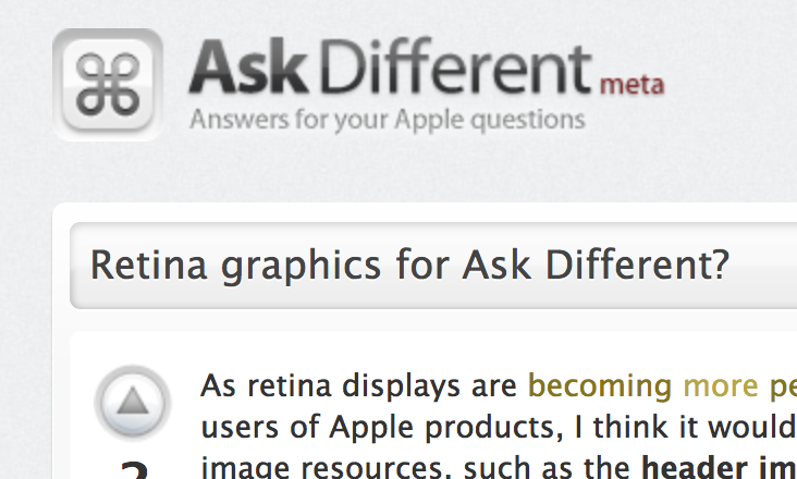
I noticed that Ask Different used to have site-specific arrow buttons:

enter image description here

Screenshot from: Retina graphics for Ask Different?

Could we perhaps make them site-specific once again?

3
  • The only problem with that, is if (or rather, when) the Apple UI changes, then SE would have to follow the change. Which means... more work. Therefore, it's never gonna happen! :-) Commented Jun 9, 2023 at 15:12
  • @Greenonline Depends on how much people hate the current design! Commented Jun 9, 2023 at 18:17
  • 3
    A lot of sites used to have their own button design; that all got swept away a few years ago in the last [but one] design 'upgrade'. Site designs now all have fewer customisable elements. One recent graduate is Sound Design. You can see from that what elements can now be customised - background, logo, badge icons [some have a serif font too]… I suppose we could ask for our badges to be apples with a bite out  … but then again, that's a trademark… whereas the ⌘ symbol isn't. It's a 'point of interest' unicode symbol.
    – Tetsujin
    Commented Jun 10, 2023 at 12:33

You must log in to answer this question.

Not the answer you're looking for? Browse other questions tagged .